How Less is More - A Look at Minimalist House Design and Minimalism
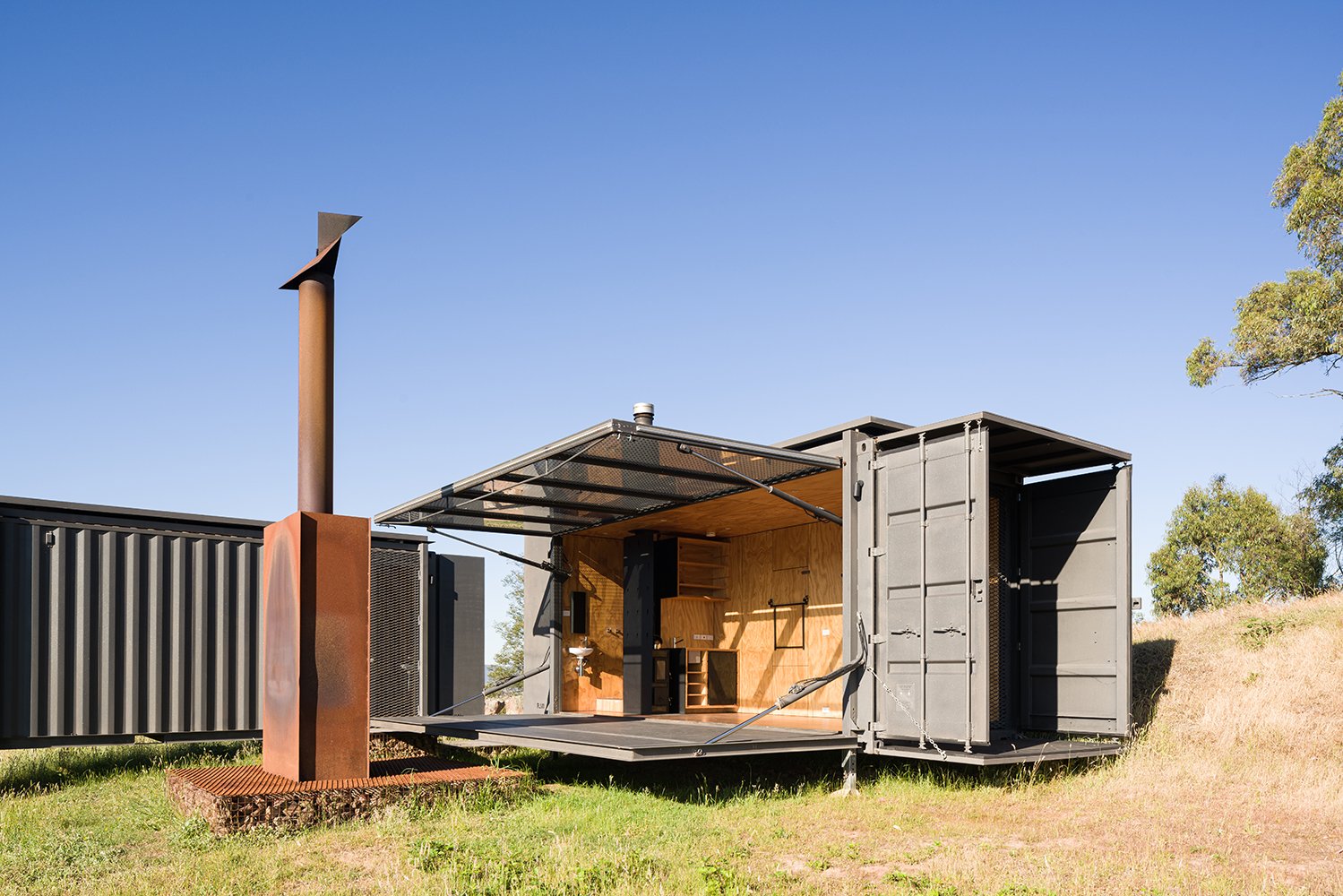
Less is more, now you’ve probably heard this phrase once or twice, it was a popularised by German-American architect Mies Van Der Rohe, who was incredibly influential in the modernist movement during the 1950s. What does it mean though? At its core, it’s about reducing a building down to its bare essentials, which reveals the true essence of the design and achieves simplicity. To achieve this, focus is placed on simple forms, a limited material palette, clean lines and removal of ornamentation. However, removing excess space, having an honesty of material, as well as access to light and landscape is vitally important.
Form is Function
Keep with the theme of Modernist phrases, “form follows function” is all about ensuring space is used effectively by focusing on the function and purpose of the building. When looking at this at a house scale, it’s best to focus on the layout, making sure room placements, sizing, shape, etc fits the purpose of the room (and house a whole), and allow the form of the building to be generated from that. The complete opposite of that is sketching out an abstract shape, and then proceed to force rooms and spaces into it, which will more often than not result in dead and wasted space.
Limited Material Palette
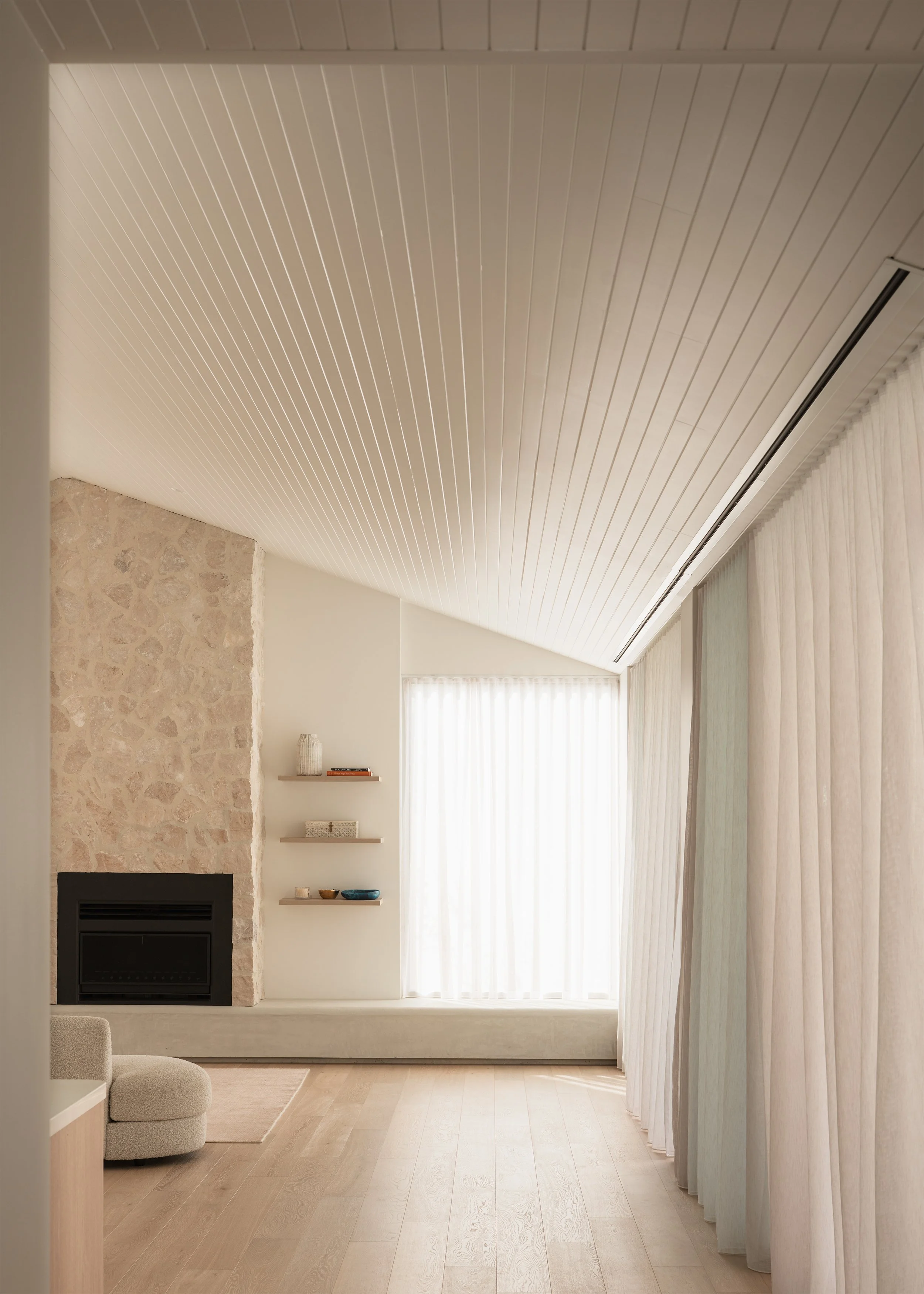
The material palette is crucial in achieving a minimalist outcome, as too many colours and materials and the home begins to feel overly busy and visually distracting with no room to rest your eyes. While the go-to palette of a minimalist interior revolves around whites, beiges and greys, colour, warmth and texture can be introduced through the use of timbers or stone. Glass is another core material for simplicity, allowing access to light, ventilation and views, but should be used appropriately based on purpose and context.
Clean Lines
Have you ever wondered what exactly ‘clean lines’ means? You hear architects and designers say it all the time, and it’s usually in reference to lines that are unbroken and uninterrupted. An example of this is at the point where the wall and ceiling meet, which in a lot of homes a cornice is installed, but what you get is a visual break between the wall and ceiling. A minimalist house however ensures the wall/ceiling junction is met perfectly, eliminating he need for cornice, and as a result there is a small single line around the room.
No Ornamentation
Minimalism was born out of the Modernist movement, where architects started to reject elements that brought no function to the building, such as ornamentation. Decoration used to be seen as a luxury, as more time and labour would be needed, however with the rise of mass production, it became cheap and unnecessary. The removal of ornamentation means less visual distractions, and the focus can be on the detail and texture. This can also apply to styling your home like a minimalist, where the act of decluttering and removing ornamentation allows you to have a space with room to breathe, and display what is most important to you.
Removal of Excess Space
Minimalism, whether it’s in architecture or the lifestyle movement, is about removing excess. In architecture this may refer to materials and ornamentation, but it should also focus on stripping away excess space. In Australia the size of an average home is rising, where in Melbourne it is currently 253m², up 23m² from 2005-2006. Pair this with the statistic that the average household is declining, from 4.5 in 1911 to now at 2.6, we are building bigger homes with fewer people who live in them. This results in rooms that are unnecessarily over-scaled, bedrooms that may only be occupied once or twice a year, and entire rooms that only sounds good when trying to show off to your neighbour.
Honesty of Materials
In architecture, honesty is about allowing the building to be true to itself, and while this can apply to many facets, it is critical when it comes to materiality. Many materials can be faked, whether with plastic, aluminimum, wall paper, veneers, textured paint, and so on, and while the look can be achieved, the true texture and warmth is lost. An aluminimum timber panel may be used on the exterior, as it requires no maintenance and is more cost effective, however if you want your home to look like timber, then you need to take on the required responsibility.
Light and Landscape
While light and connection to landscape can be found across nearly every architectural style, minimalism is only enhanced when merged with biophilic design. Through the use of direct nature, indirect nature and connection to place, a wealth of health benefits, both physical and mental health, along with environmental benefits, can be achieved. This can be done by having access to light and air, a connection with water, plants and being able to observe the weather and landscape.
Videography and editing, photography and words by Anthony Richardson.


