How This Minimalist House Uses Muted Tones to Bring Tranquility to the Family
How This Minimalist House Uses Muted Tones to Bring Tranquility to the Family
24th of Janaury, 2023
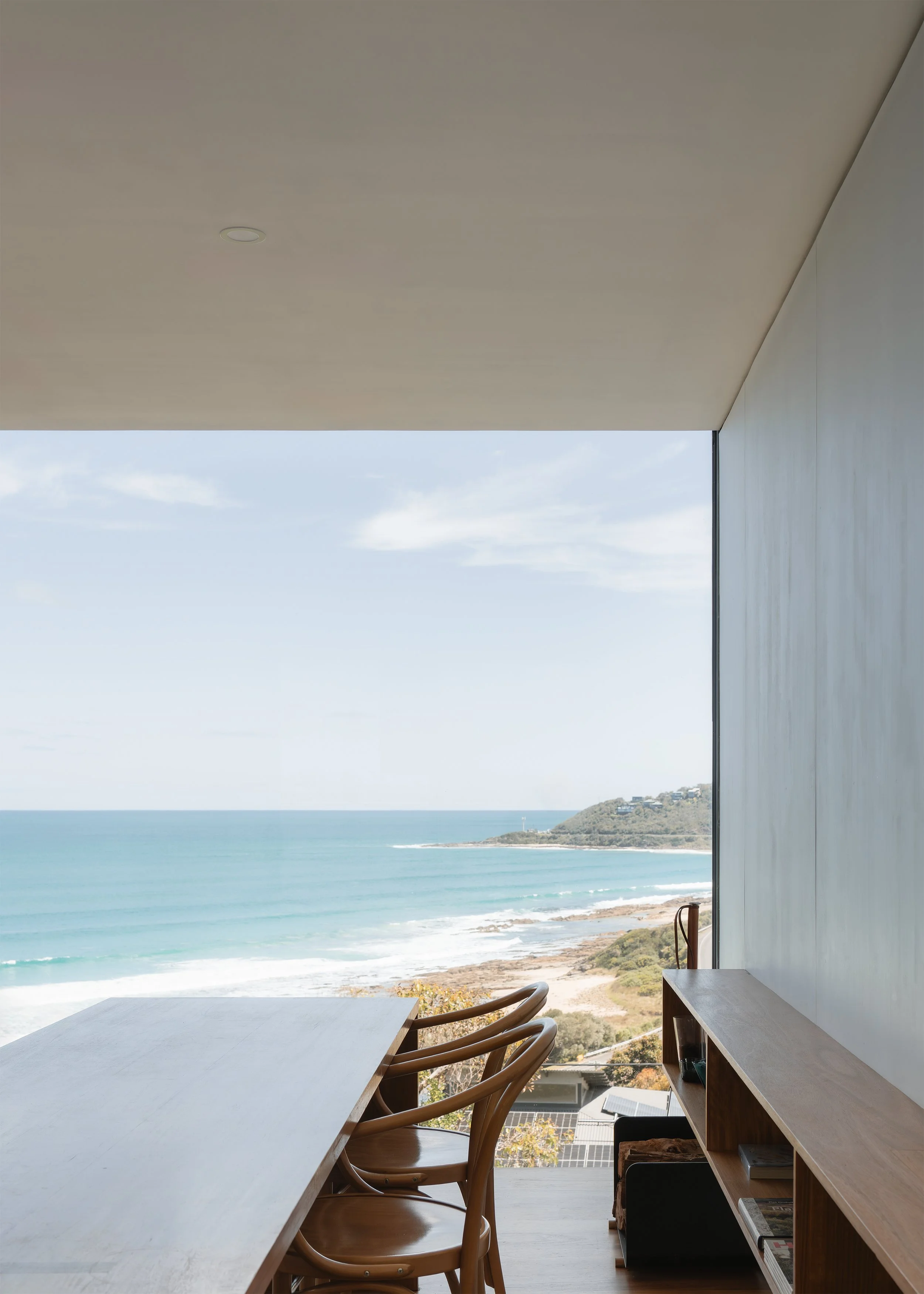
Tucked behind a modest Victorian cottage is a minimalist extension with an interior that brings a sense of peace and tranquillity. The clients wanted their home to act as a sanctuary, providing calm and relief from the busy life outside.
"Every design decision that we made throughout the process kept coming back to that simple design that they were after." Says Jane Merrylees, Director of Merrylees Architecture and Interiors. "They wanted it to feel relaxing. They wanted it to feel like a sanctuary."
Merrylees Architecture and Interior believes the best design is derived from the individuality of their clients. Their clients for Elsternwick House were design-minded with love for minimalist architecture, which is reflected in the final design.
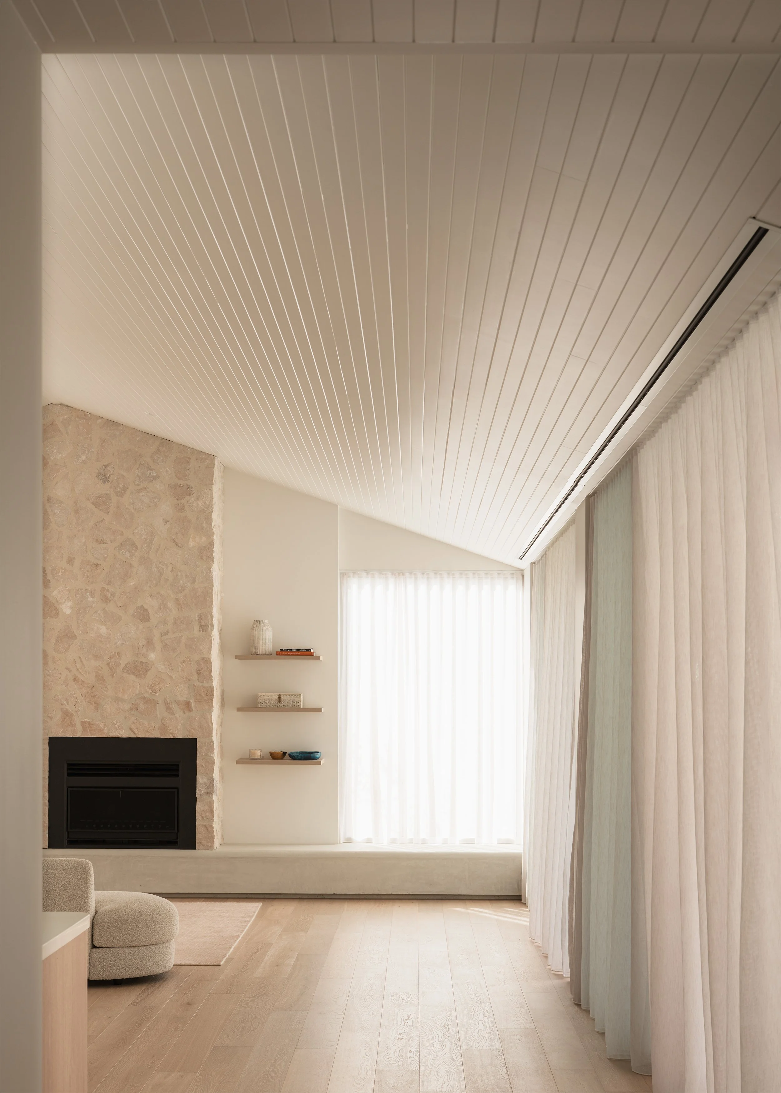
The minimalist house features muted tones, with soft greys and timber accents to provide warmth and texture. A burnished concrete slab defines the start of the extension, a design element that the clients were keen to incorporate from early discussions in the project.
At 177m2, the home is compact for a family of four. The front two bedrooms of the Victorian cottage are retained, with a bathroom and powder room reworked in the existing. The new extension features an open-plan living, kitchen and dining space. Off the kitchen is a multipurpose room, serving as a home office and a second living space. Further towards the rear is the parent's retreat with ensuite and a courtyard, making it difficult to leave the bed in the morning.
Plume was engaged to design both the front and rear garden, focusing on following the minimalist design language of the home.
The living area and home office feature joinery with pocket doors, allowing the TVs to be hidden out of sight when entertaining. Large cavity sliders to the parent's retreat and home office can be tucked away for a more open feel or closed to create a more intimate or private setting.
"The minimalist interior feels really relaxing to me; everything feels uncluttered." Says Jane Merrylees. "Everything is here because it's intentional. Our clients wanted it to be this way. It feels calm and like a sanctuary."
Designed by Merrylees Architecture and Interiors, landscape design by Plume.
Videography, photography and words by Anthony Richardson.


