A Contemporary Brick Home Extension Now Connects with the Garden
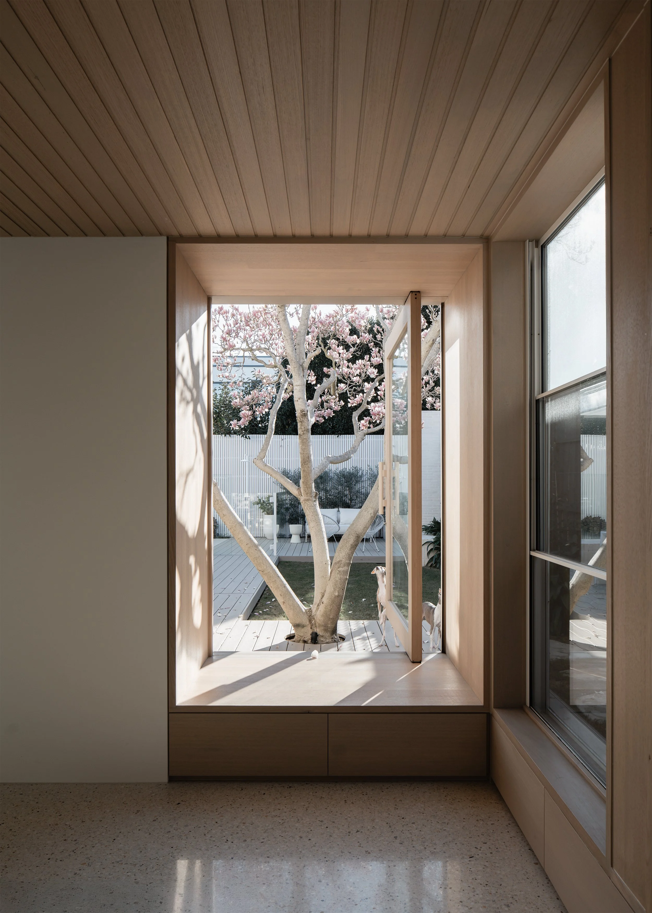
The family of this 1930s Canterbury cottage had plenty to love about their home, but it wasn’t perfect. While they were happy with the bedrooms, living and dining room, the kitchen was not functional, and there was a lack of connection to the backyard.
They approached Inbetween Architecture to design a contemporary addition that would make their home perfect.
“They [the clients] really kept emphasising that they want to be able to just get to the backyard, be able to see it, be able to just get out.” co-Director of Inbetween Architecture John Liu says.
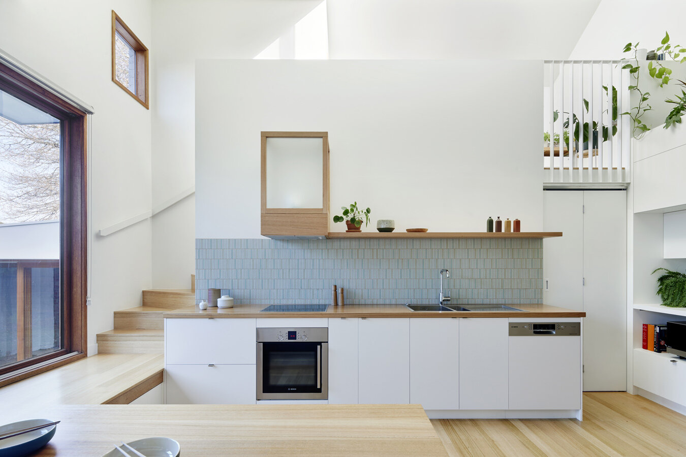
The challenge for Inbetween Architecture was complying with the heritage constraints of the house, with the addition not being allowed to be visible from the street. A mezzanine level would be required to address the brief, so the architects looked at going down to give them the height to go up. This split level created unique moments in the extension, with bench seats becoming floors, and the secondary kitchen being lower allowing for a pass-through to the main kitchen. However, there was another added benefit.
“By going down, you’re better connected with the backyard. That idea of actually stepping down inside, creating a split level, we thought that would be a good strategy here,” John explains. “By lowering your eye level, you immediately connect better with the backyard.”
The new extension pays homage to the 1930s cottage through a reimagining of the materials. Timber is used on different surfaces, such as floors, benchtops and tables. With such a multifunctional space, it made sense for Inbetween Architecture to use a material that could be used in a variety of ways. The original home used bricks and rough cast render but had a heaviness to it. Wanting to express the beauty of bricks but have a lightness to it, they were painted white, giving a contemporary look to the historical material. Bricks from the cottage were recycled and used as part of window sills in the new addition. Further to the idea of reuse, the landscape designer, Sam Cox Landscape, took a substantial bluestone slab and used it for an outdoor bench seat.
The truly remarkable aspect of this home lies in its ability to inspire the owners, one of which is an artist.
“The client now spends a lot more time doing his artwork, and that aspects of the home and of the garden are not only inspiring him to do more work and to want to have creative output,” explains Steph Richardson, co-Director of Inbetween Architecture. “In his words, he said this space motivates him. He feels like there’s more in him that he wants to express.”
Escher House by Inbetween Architecture, landscape by Sam Cox Landscape.
Production and words by Anthony Richardson, photography by Tatjana Plitt.


