Plenty of Natural Light Allowed This Extension to Have a Sophisticated Dark Interior
Plenty of Natural Light Allowed This Extension to Have a Sophisticated Dark Interior
December 3rd, 2021
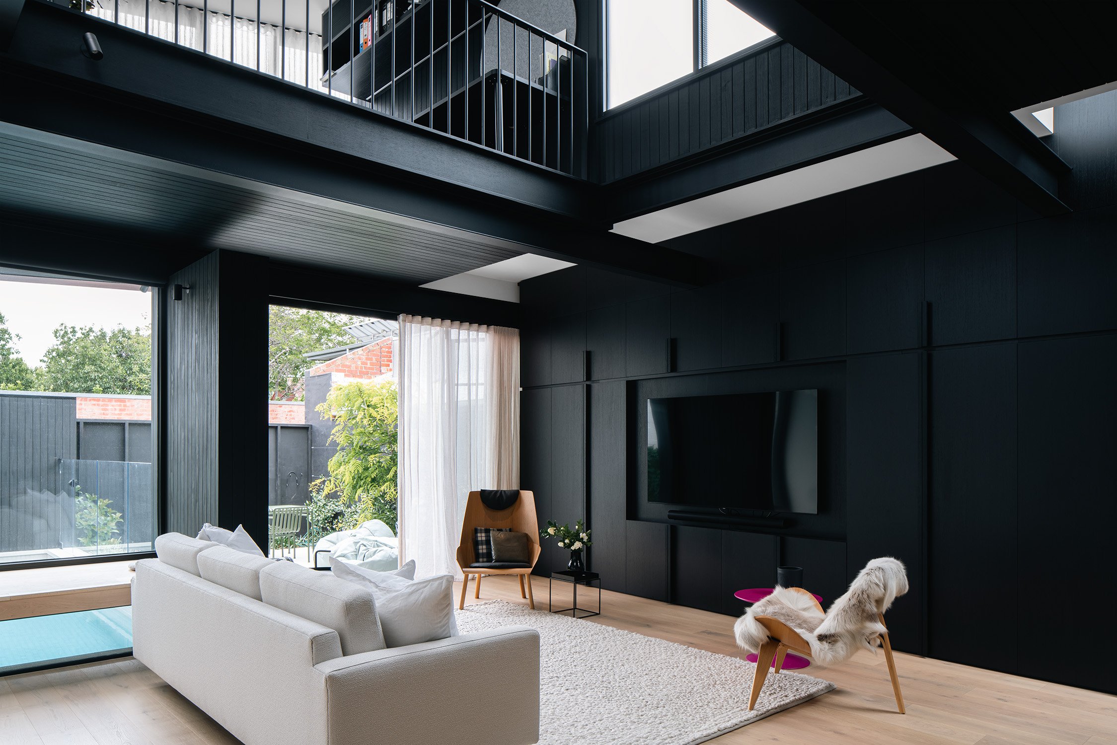
Dark and moody interiors can be challenging and go against the typical light and bright approach. However, if you get the fundamentals right, the result can be a rather sophisticated, mature interior that evokes a sense of calm and enclosure.
The clients of Middle Park House, a builder by trade and Director of In2Projects, and his wife, a lover of modern architecture, engaged Chiverton Architects to design a rear extension to their heritage home. Unfortunately, the 1970s addition needed to go; being dark and uninspiring, it no longer served the owners' purpose and separated the main living functions.
"Historically, people would have used the house in a very different way." Barnaby Chiverton, the architect, explains. "Then, by the time I came here, it had a 1970s addition that felt substantially worse than the front of the house."
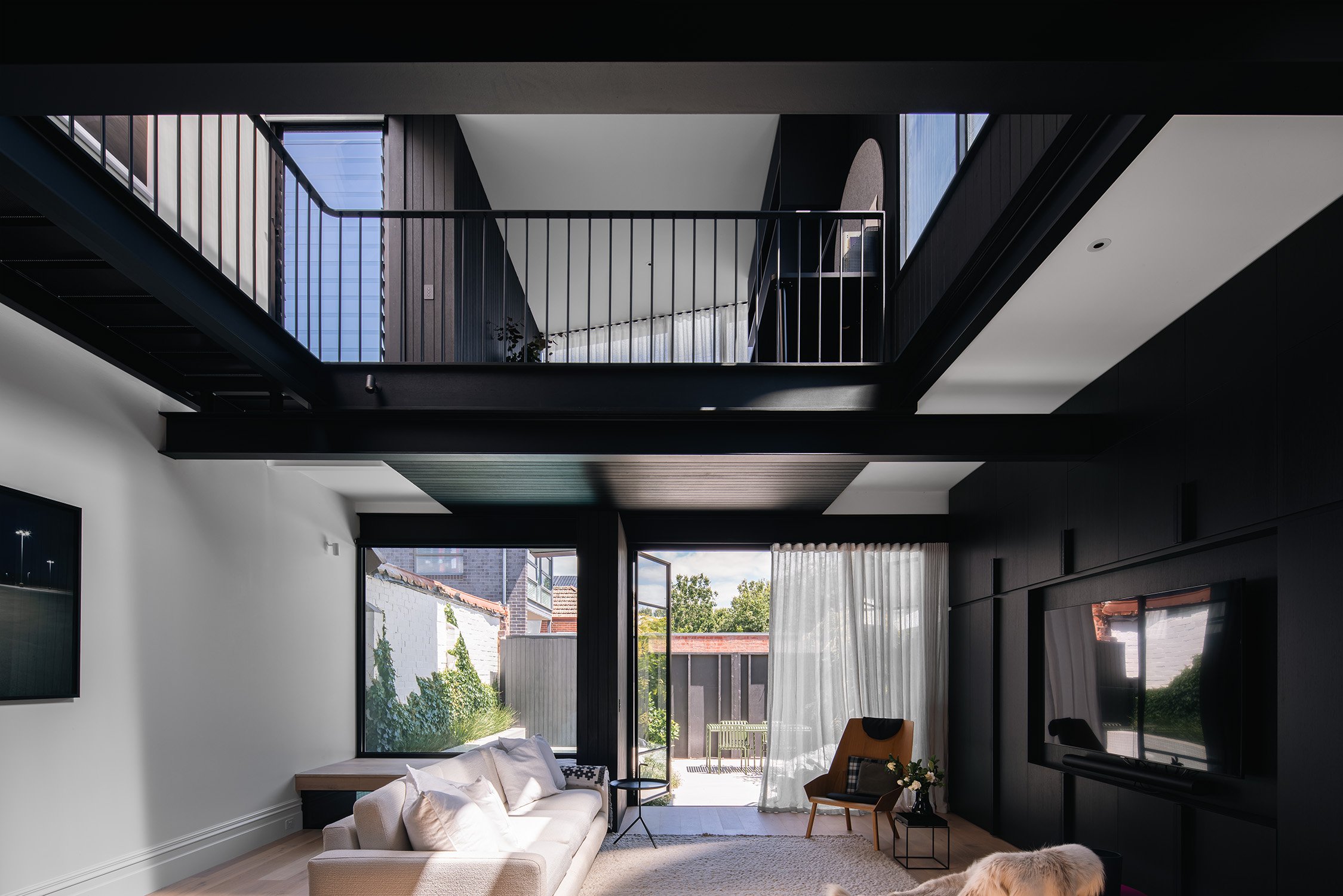
To take the place of that tired addition was an extension that fulfilled the owners' desire for a singular kitchen, dining, living space, and additional bedrooms, bathrooms, and an office. Chiverton Architects designed a two-storey extension with a large void and a perforated gangway that allowed light from above to pour into the living area.
"We were very keen on making the building feel lighter." Barnaby explains. "That gangway runs across, it's perforated, and above that there's a skylight running the full length of the building, so light pours in, goes through the gangway, goes around the side of it, and there's a real sense of lightness in that area."
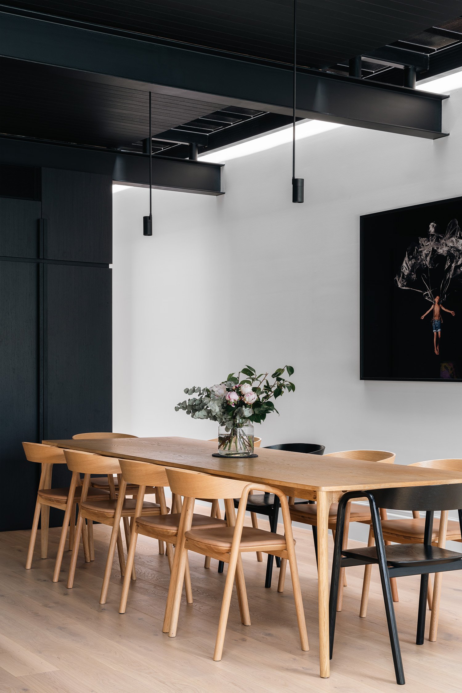
The interior palette was one of a few proposals put forward to the clients. Several schemes were rendered, such as an all-timber scheme, an all-white scheme, a scheme with bold colours, and the black one.
"We're able to do that because we've been able to bring in so much light into the building." says Barnaby.
The other main aspect of the home was the rear facade, which would be visible to the clients and neighbours and people passing by. The Mondrian-inspired glass facade is pushed out over the ground floor, providing shade to the living area.
The repeating steel structure, soft light from the skylight above, the minimalist back garden and movement of water from the pool that seems to come right inside, along with the darker material palette, truly creates a sense of calmness in the home.
"There is that sense of calmness to this building." explains Barnaby. "There's a person that I work with, Paul Rudolph. His house had that kind of obvious structural element working over and around structure to create sculptural forms. That architect really influenced me on this project."
Go to Squarespace.com for a free trial, and when you’re ready to launch, go to http://www.squarespace.com/thedesignemotive to save 10% off your first purchase of a website or domain.
Videography, photography and words by Anthony Richardson.


